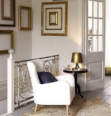
Olympians aren’t the only ones going for gold this time of the year. Grey, gold, black & white is another color combination that seems very fitting this time of year. These colors seem to be more soothing and elegant, a nice switch from the dark red and forest green we find ourselves surrounded with each December. While browsing around through a slew of home decor items, some nice ones popped up as you can see. What are your thoughts on gold?


Nobody will forget about decorating the Christmas tree, the mantle and even the yard. Although it’s easy to miss that the Christmas table should also be decorated. Of course, it will be full of delicious food but dining in style is always better. There are plenty of things to consider when it comes to decorating the Christmas table. You should make some centerpieces, place cards, candle decorations and many other things. Although all these decorations worth the spent time because they could really help make the Christmas Day even more memorable.

Check out also these Christmas table settings. Aren’t they beautiful?


Sometimes you come across a picture that sparks a color combo that you might want to use in your home. I’ve always loved the color turquoise and the coral hue for summer. What better way than to combine them both. Typically seen in jewelry, it makes for a fresh Spring feel to an interior space…


I am loving this light teal color these days. There’s something about it that’s both vibrant and calming. Much like what life ought to be.


Love, live and laugh. Fall in love. Explore the world. Find tranquility. Laugh with a friend. Make life worth watching.


You can give a modern interior an additional layer of individuality by adding the odd antique to the mix. Just as you can give period rooms an extra edginess with a few modern pieces. Bright vivid, contemporary colours can bring fresh life to an old-fashioned building


Trends in decor and table setting?

  • Restructuring is the big trend. We rethink and recreate new from the old, to lessen our carbon footprint. It’s now trendy to use old clothes, curtains and fabrics that were once part of something else; take them apart and turn them into a tablecloth. Old plastic bags have now become desirable cushions. We use things that will last longer or are completely disposable and bio-degradable
  • Instead of using perfect, cultivated, imported flowers we opt for natural displays with leaves, straggly plants, twigs, branches and items foraged from your own garden
  • Growing displays are a big trend: fruit trees in blossom, vegetables in pots, etc.
  • Tableware is functional – no more pretty plates that are hardly ever used. Pottery and earthenware is the big trend
  • Using contrasting materials, such as a rough, recycled tablecloth offset by very thin glassware, rustic wooden or pottery plates and fresh green leaves in unusual displays
  • Intimacy is also a big trend. Invite smaller groups of guests and decorate their place settings with more intimate and personal displays of beautiful objects
  • Eating more with our hands is another welcome trend, breaking away from old notions of etiquette
  • Restaurant concepts are changing as well, becoming more purist and specialist. Think of a stylish neighbourhood establishment that serves good food in a beautiful environment

I was lucky enough to meet Otto de Jager this week…

Otto de Jager is well known for his highly original creative ideas, constantly innovative approach, and unrivaled professionalism in the field of event management.

For further information visit the website at www.odjevents.com


It’s official. Never in property history has it been harder to sell your house at the price you’re asking.

The secret of getting buyers’ hearts to beat a little faster, is not to go for demureness and inoffensive colours, but to pull out all the stops when it comes to expressing your personality.

There is an old school of thought which says you should make the place as anonymous as possible, so as not to put people off. But I find that way of thinking uncreative, unimaginative and, in the long run, unattractive to a potential buyer.

I believe there’s a happy medium whereby you can enhance the look of your home without making it off putting. There is nothing more exciting than creating your own home, in your own style. Apart from anything else, it’s a good way of making money!

BE BOLD

I think it’s important when you’re creating a style for your home to listen to your aspirations rather than your fears. I often hear people say: Oh I would never dare to use such a colour, I think I’ll stick with beige. To my mind, if you really love something, it can’t be wrong. And if you really do love beige, so be it.

Add an organic note to your bedroom….


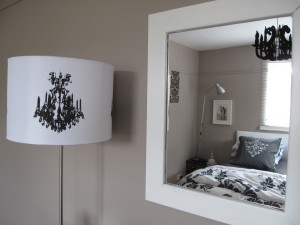
This colour harmony is most prominently found in nature, within the extensive shades of green foliage. Monochromatic harmony is one – hue harmony, which combines colours derived from a colour range of a single hue. These schemes tend to be comfortable and relaxing, because they blend well with most lighting conditions. Monochromatic schemes can be further cooled with the addition of neutrals, such as white, grey and black. This bedroom displays a beautiful collaboration of textures and patterns using only black and white, demonstrating a really chic and glamorous design. This colour scheme is ideal for small spaces, areas lacking natural light or bedrooms, as it has a soothing and light reflective quality

Some inspirations for the bedroom interior I created above…..


An article I read recently summed up the appeal of black and white so well: “Solo, black can be mysterious and edgy, sophisticated, elegant and sexy. Snowy white is pristine, innocent, fresh, minimal.” Indeed. Black paired with white represents balance. It’s classic and elegant. There is harmony in the combination, and yet it remains exciting.


2011 is a year of mixed emotions and boy is it reflected in design. Many of the colors being used in interiors are bold and bright, suggestive of optimism. Could people be reflecting hope through their homes? Two of the top color trends this year are lemon and lime.


Lemon: The Vibrant Yellow

Symbolizes

  • Happiness
  • Creativity
  • Optimism
  • Activates Memory (e.g. Post It)

As a playfully warm color, lemon will add pizazz to your space. It is striking and a welcoming “in your face” color that evokes warmth and happiness. Common areas that incorporates lemon are: living rooms, home offices, dens/family rooms, kiddie rooms, and kitchens.


Lime: Prosperity In Your Face

Symbolizes

  • Peace (Peaceful)
  • Refreshing (Tranquil)
  • Soothing
  • Color of “Fresh Starts”

Lime is an inquisitive play on traditional green that calms your interiors. Though a bright color, lime is a lighter tone that creates an airy space while complimenting modernity. As a cool tone, lime is often found in areas of the home that need an emphasis on rest and relaxation. Common areas that incorporate lime are: bedrooms, dining rooms, and bathrooms.


Decorating Tips & Tricks

  • When using as a paint color, soften it up with muted tones. This will prevent it from being too powerful and overbearing in a space
  • Lemon & lime tones are the perfect accent that will bring a drab interior up to date. Vases, lighting fixtures, and textiles are wonderful ways to incorporate the bright colors
  • Looking to anchor your space to Earth? Black and white are two neutral colors that really “mesh” with lemon and lime tones. If you have a large space and want to bring it in, use more black. If you have space that needs a little more room, use white for expansion.